(
1
)
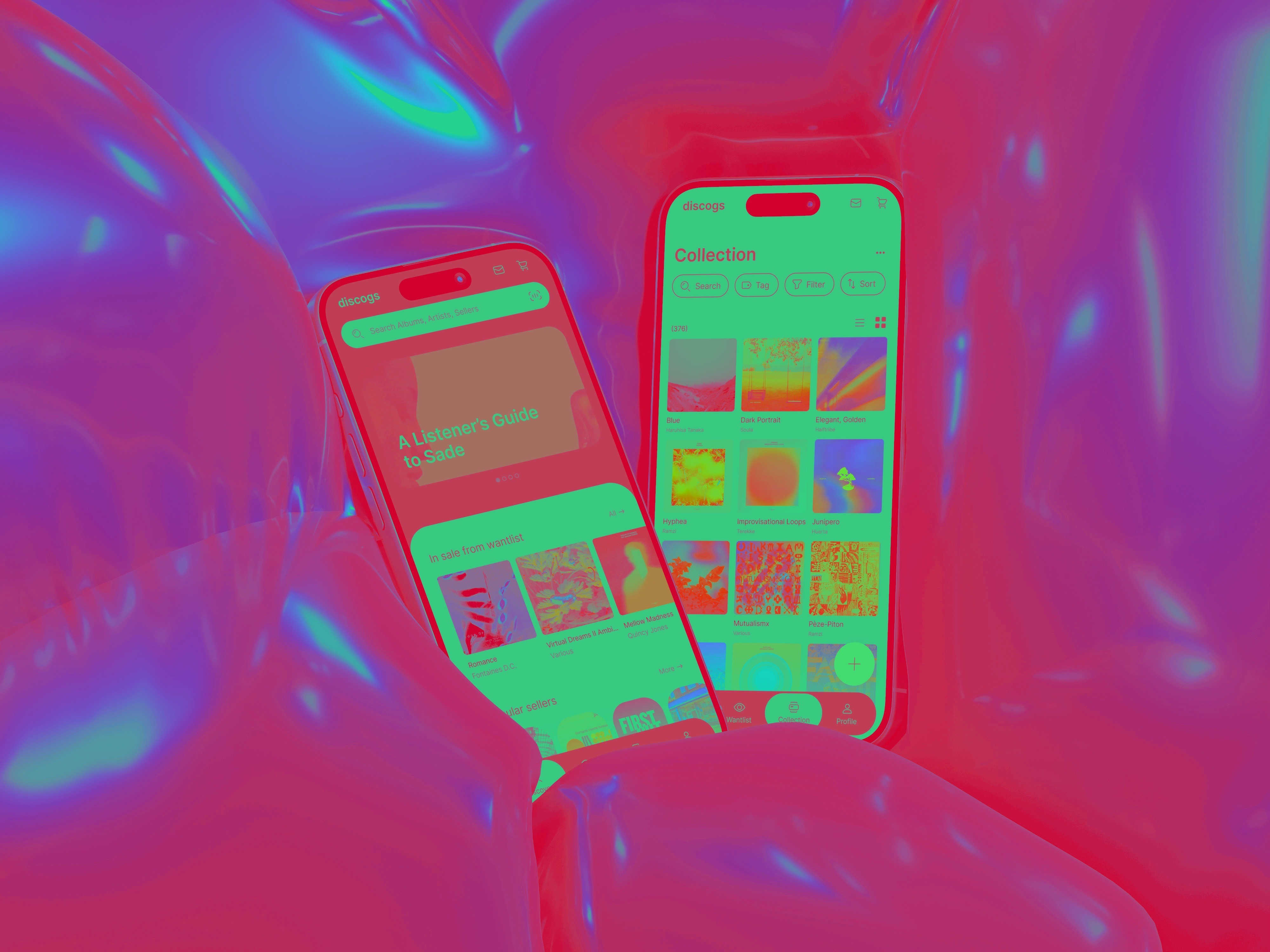
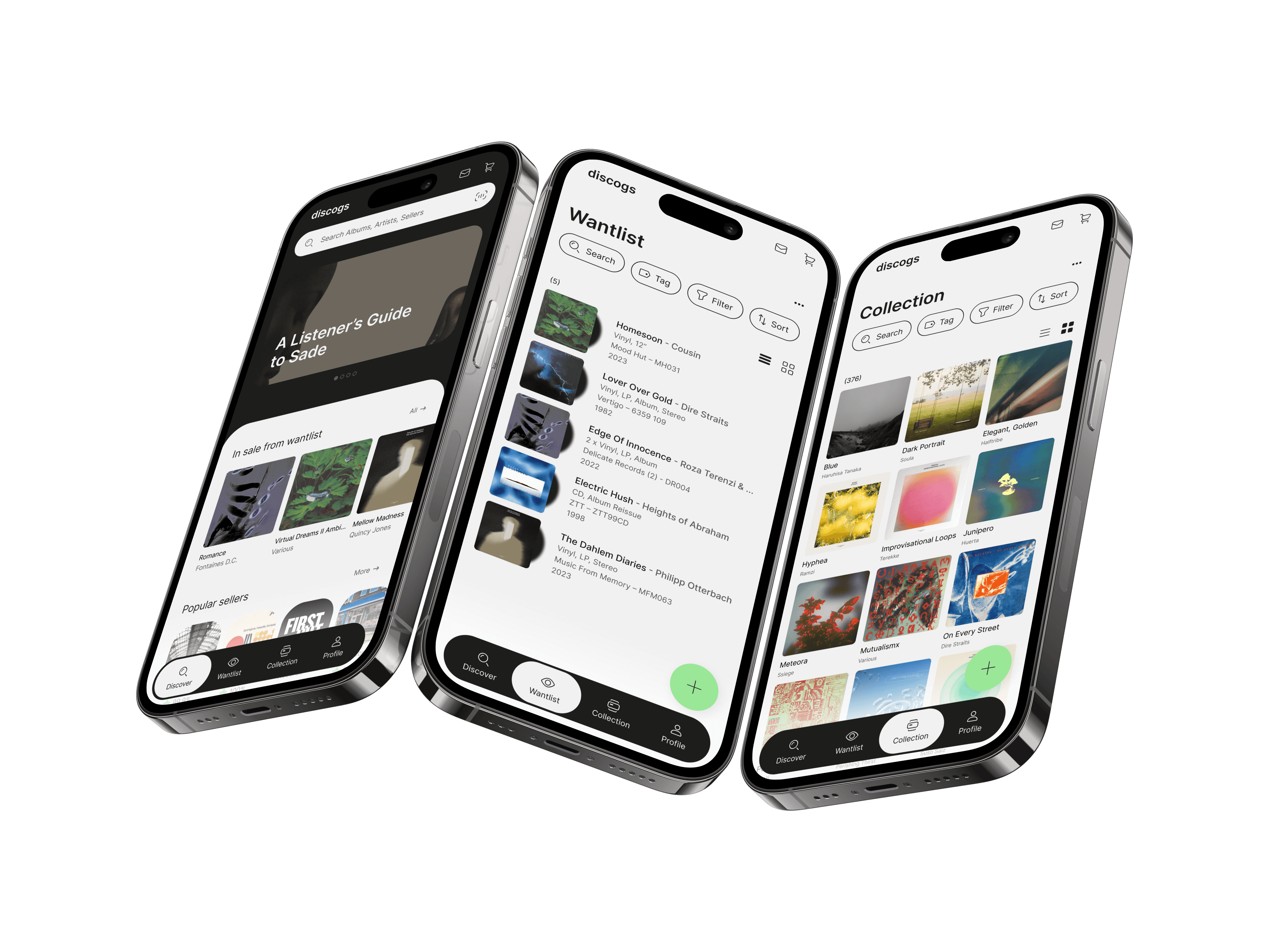
Discogs is a platform for music lovers, collectors and enthusiasts to catalogue, discover and trade physical music formats such as vinyl, CDs and cassettes. Users primarily use the application to catalogue personal collections and keep track of the music they own or want. The application also provides the opportunity to discover new releases and rare editions through its extensive database. It is also a place where users can enter the marketplace to buy and sell physical music.
It is all about connecting the music collecting community, allowing them to manage their collections, discover new gems and trade physical media with like-minded enthusiasts. It's a hub for discovering, preserving and celebrating physical music formats.
year
2024
location
Berlin
technique & tools
Figma
OBJECTIVE
This project was driven by personal motivation, experience and research with the platform, challenging me to improve my design thinking and UX/UI skills. The goal was to redesign the app within a design sprint of one week. Applying user-centered design principles and proposing improved interactions. Mainly focussing on the buying and collecting side of the target audience, challenging me to design a more intuitive, engaging and personalised experience.
PROBLEM STATEMENT
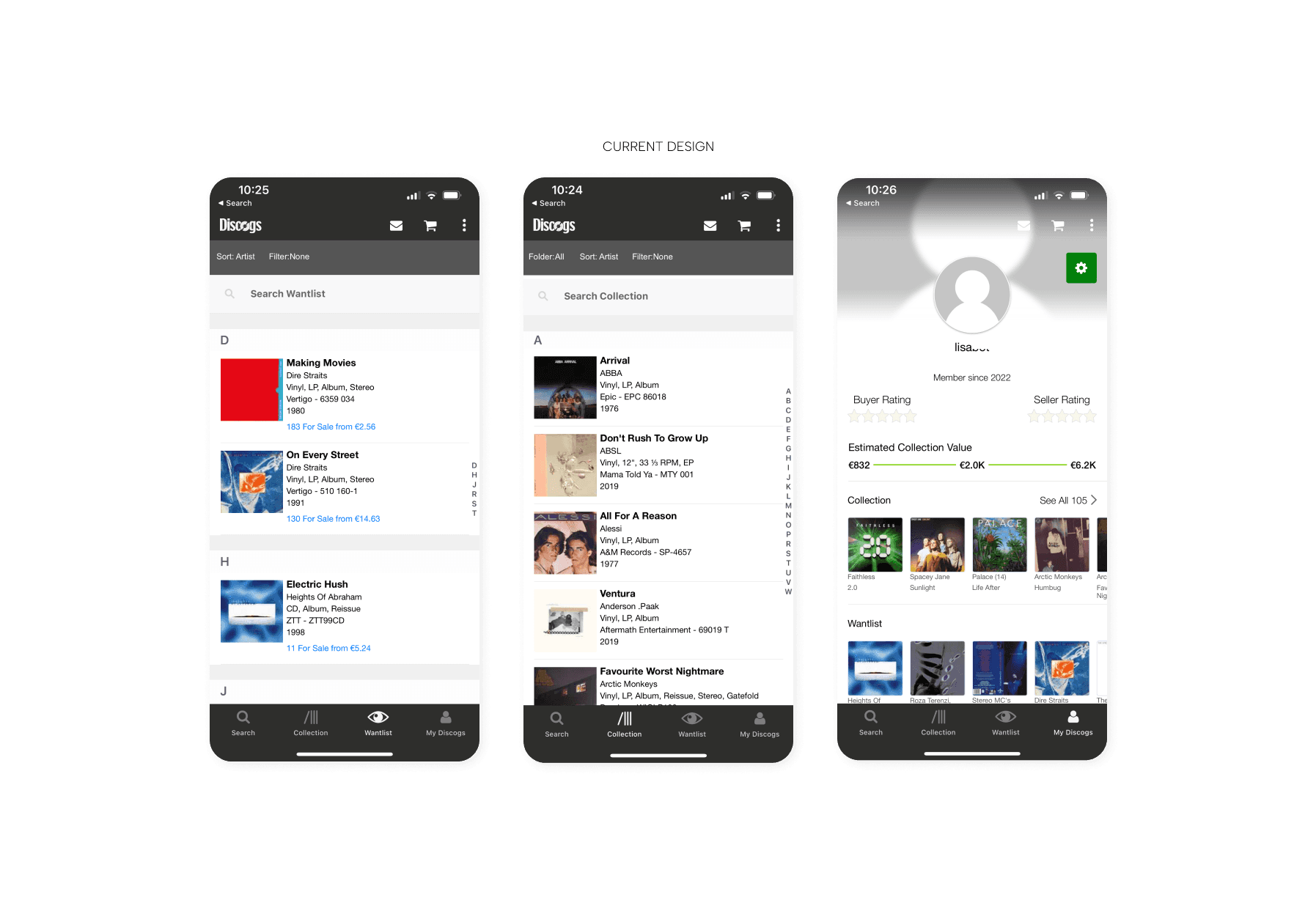
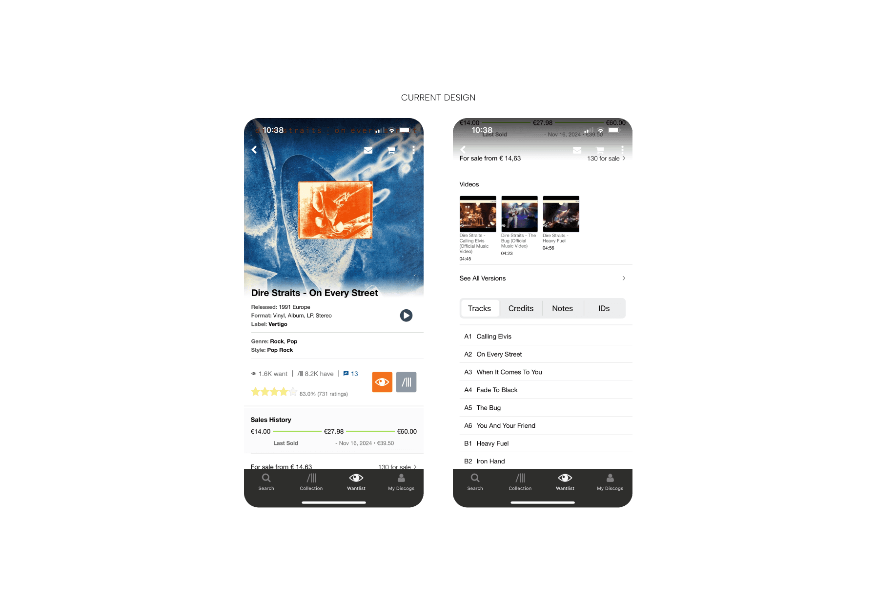
The Discogs app faces several usability challenges that impact the user experience. The navigation and interface feel overwhelming, with text-heavy layouts and a lack of intuitive organisation making it difficult for users to access features seamlessly. The search functionality also falls short, with limited precision, flexibility and error tolerance, making it frustrating to locate specific releases or editions within the extensive database. In addition, The wantlist and collection management features lack advanced organisation tools, making it difficult for users to efficiently manage or share their growing libraries. These issues highlight the key areas for improvement in this case study.
(1) COMPLEX NAVIGATION AND CLUTTERED INTERFACE
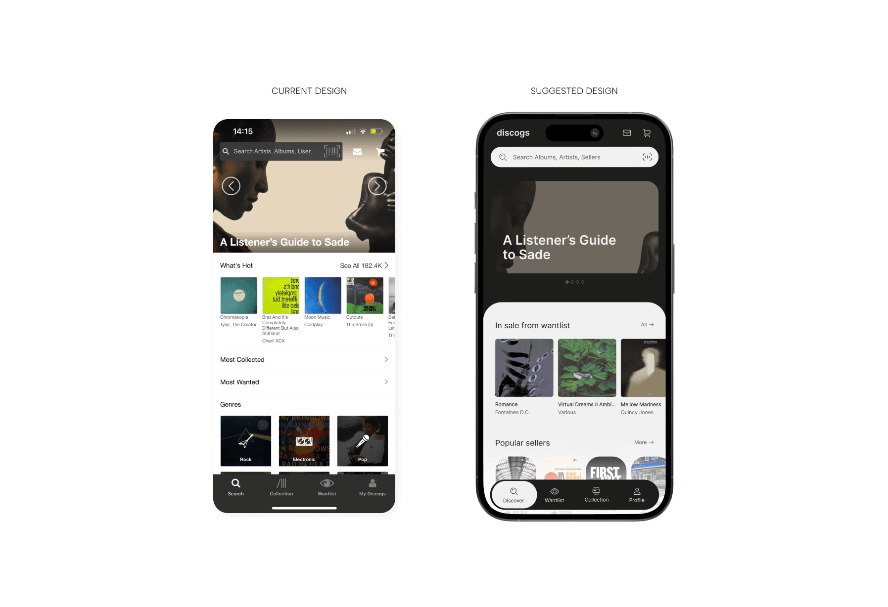
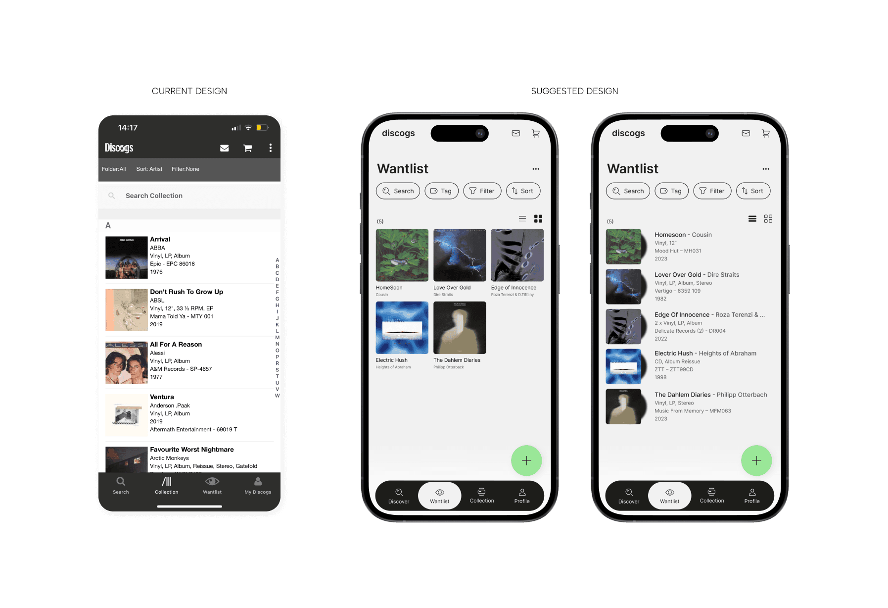
The Discogs app can feel overwhelming, especially for new users. The amount of information is extensive, and pages are extremely text heavy. To address the complexity and clutter of Discogs' navigation and interface, the following solutions are suggested:
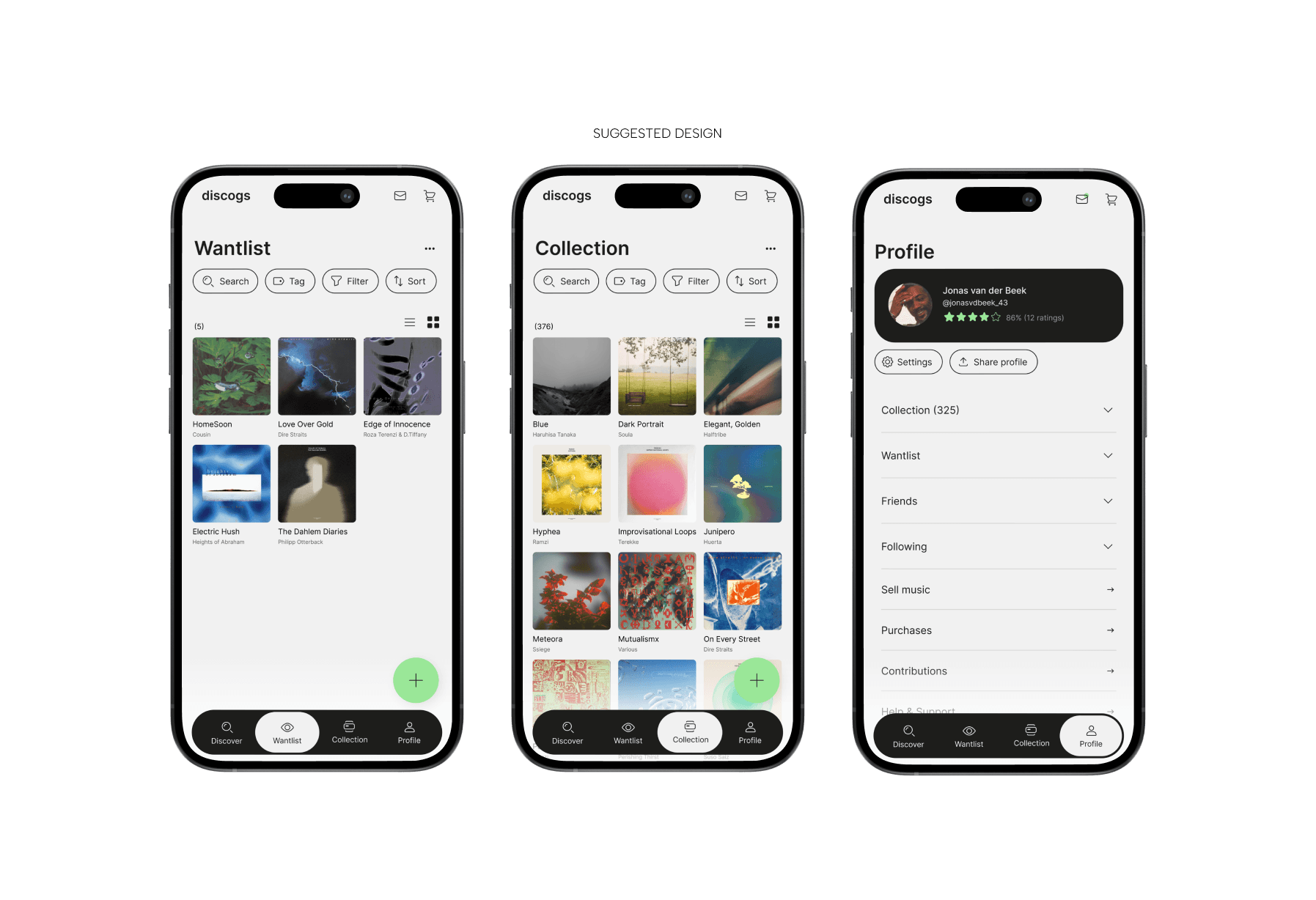
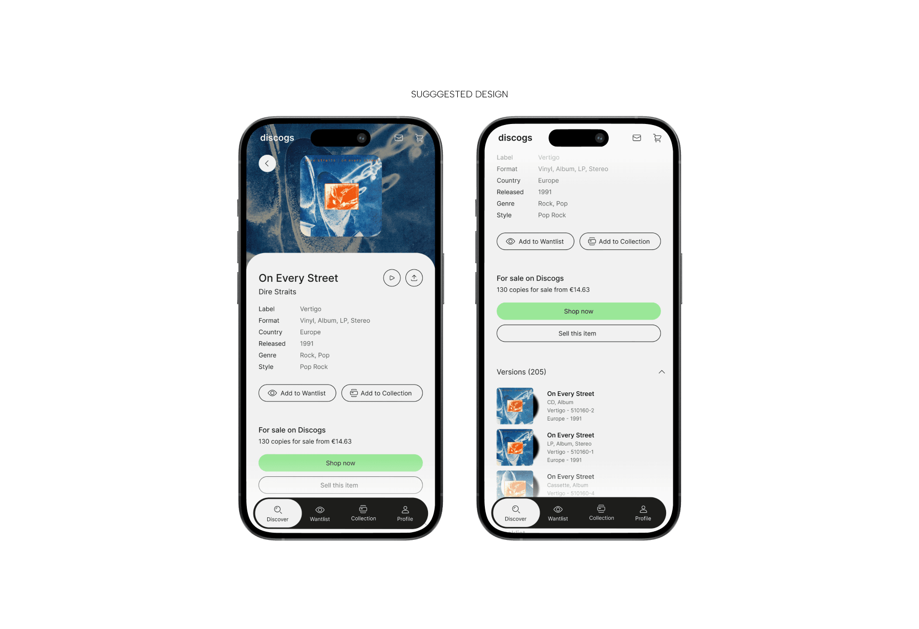
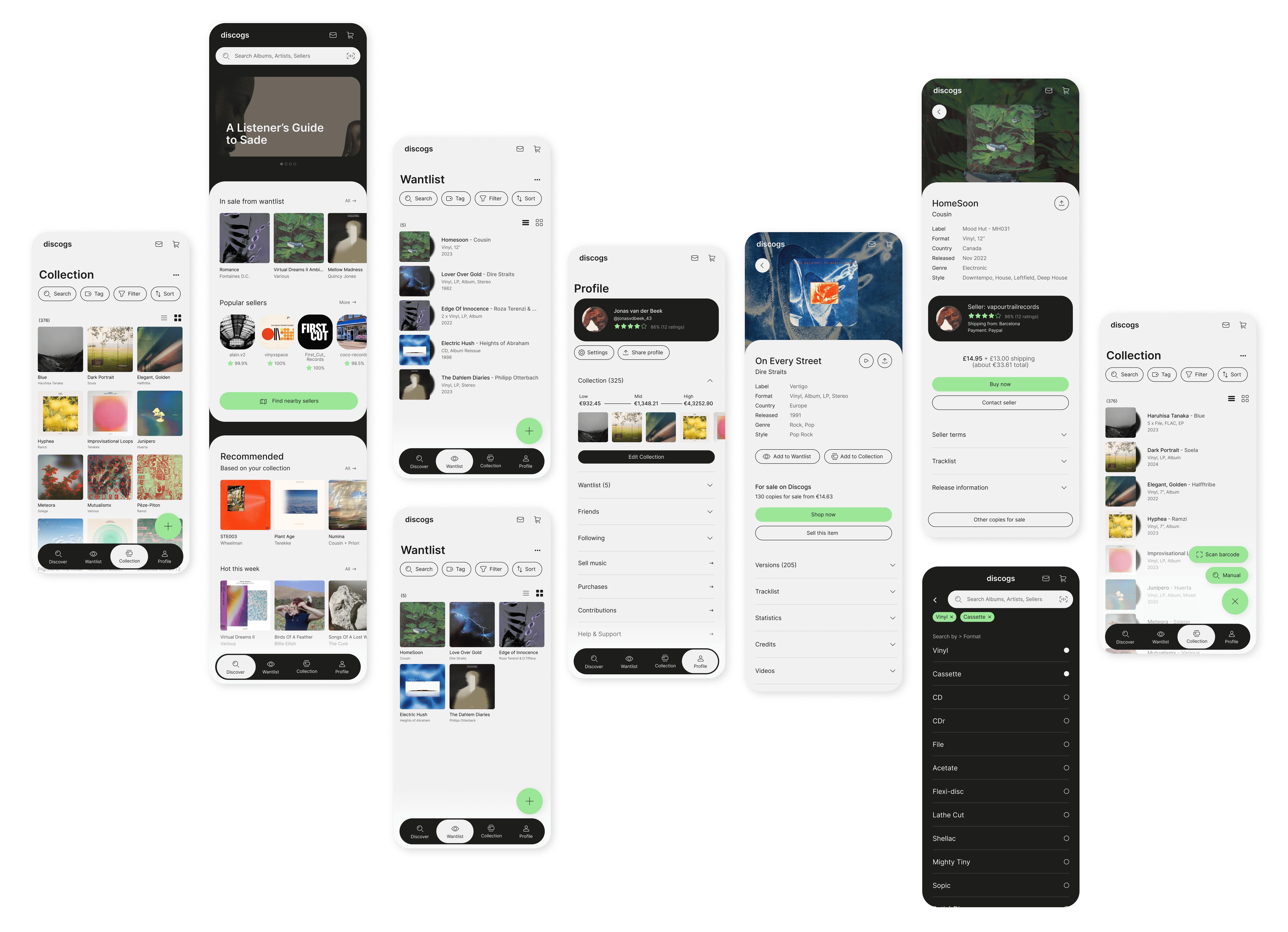
Introduce a Persistent Bottom Navigation Bar: Placing a fixed navigation bar displaying the top 4 user tasks. Future enhancements could include customisable shortcuts, allowing users to tailor their menu (or home page) to their most used functions. This would address the differences in the way buyers and sellers use the app and promote a more personalized experience.
Introducing a Cleaner Visual Hierarchy: Consistent headers have been implemented for better overall knowledge on the location within the app, as well as for content that is better scannable this way. Moreover, the text-heavy pages are reduced by introducing different color-coded sections, as well as accordion element allowing users to collapse and expand information based on their needs.
Prioritize Content Based on User Context: It is important to highlight the most important details (e.g. album title, format, year and price) when accessing a release page. This tucks less frequently used information under the accordion sections. This provides better scannable content, a cleaner look, and an overall better visual hierarchy.
(2) LIMITATIONS OF THE SEARCH FUNCTIONALITY
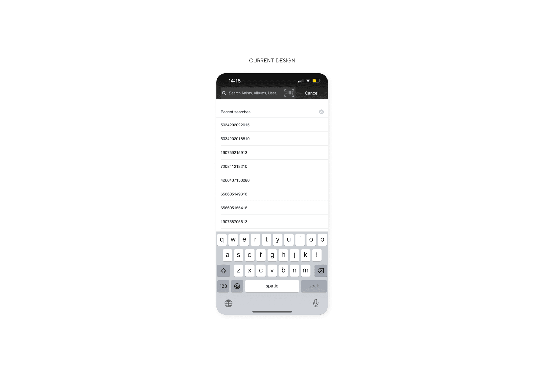
The current search functionality in the Discogs application often lacks precision, flexibility, and tolerance for user error. Given the vast database of releases, including different versions, editions, and pressings, finding specific items can be frustrating for users.
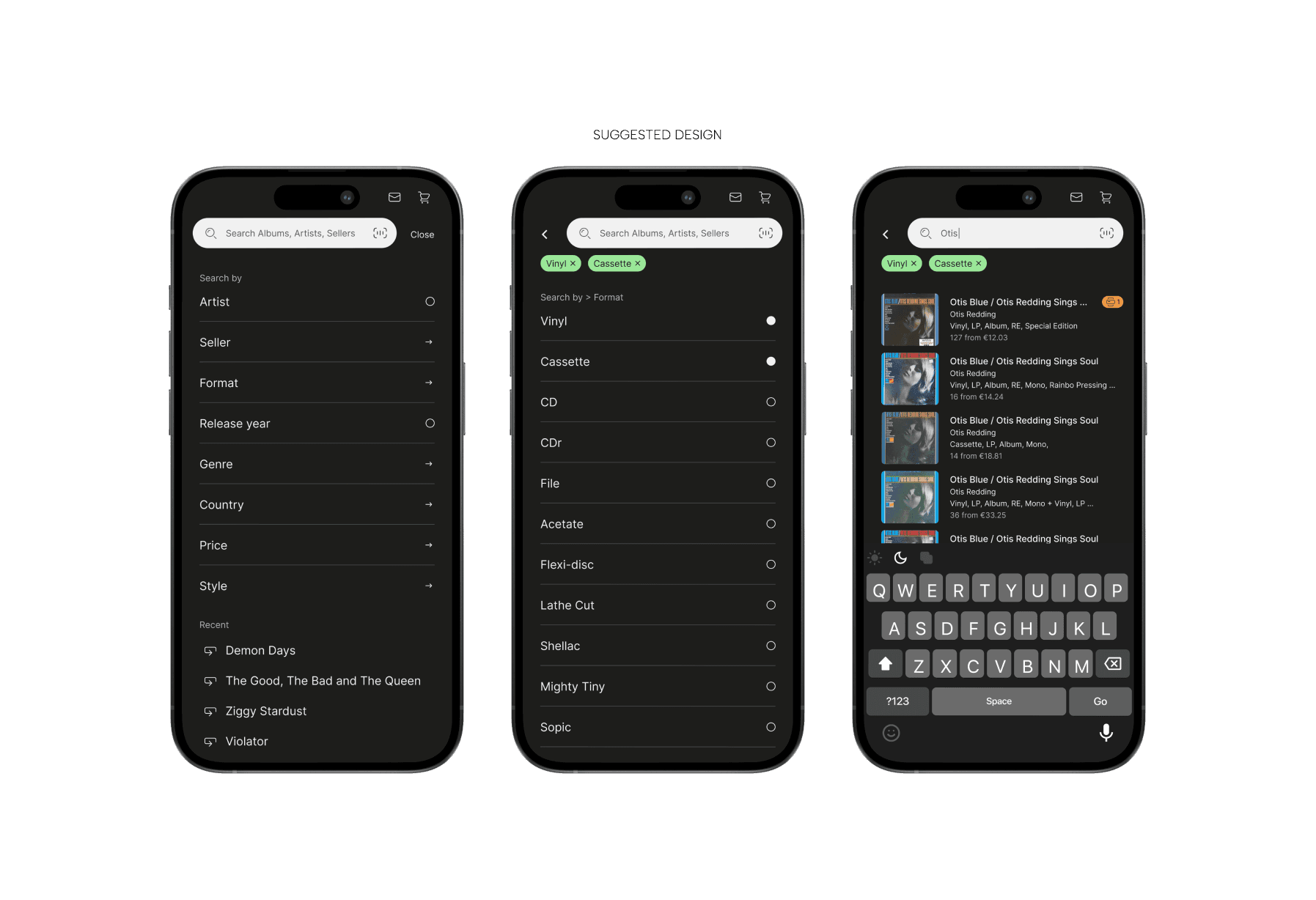
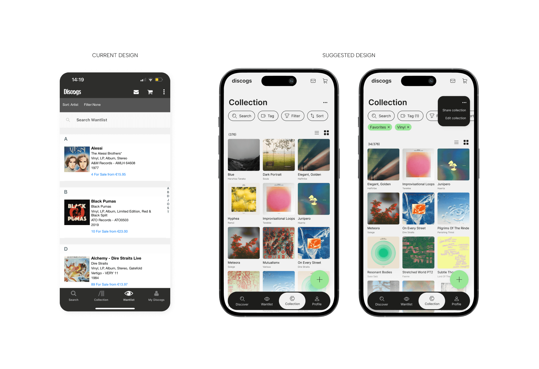
Implement advanced filters: Inspired by apps like Vinted, the search experience can be made more structured and manageable by introducing dynamic, context-sensitive filters. Allow users to filter by specific attributes such as format, release year, country, and price range. In addition, multi-level searches can be provided by allowing users to stack filters for more precise results.
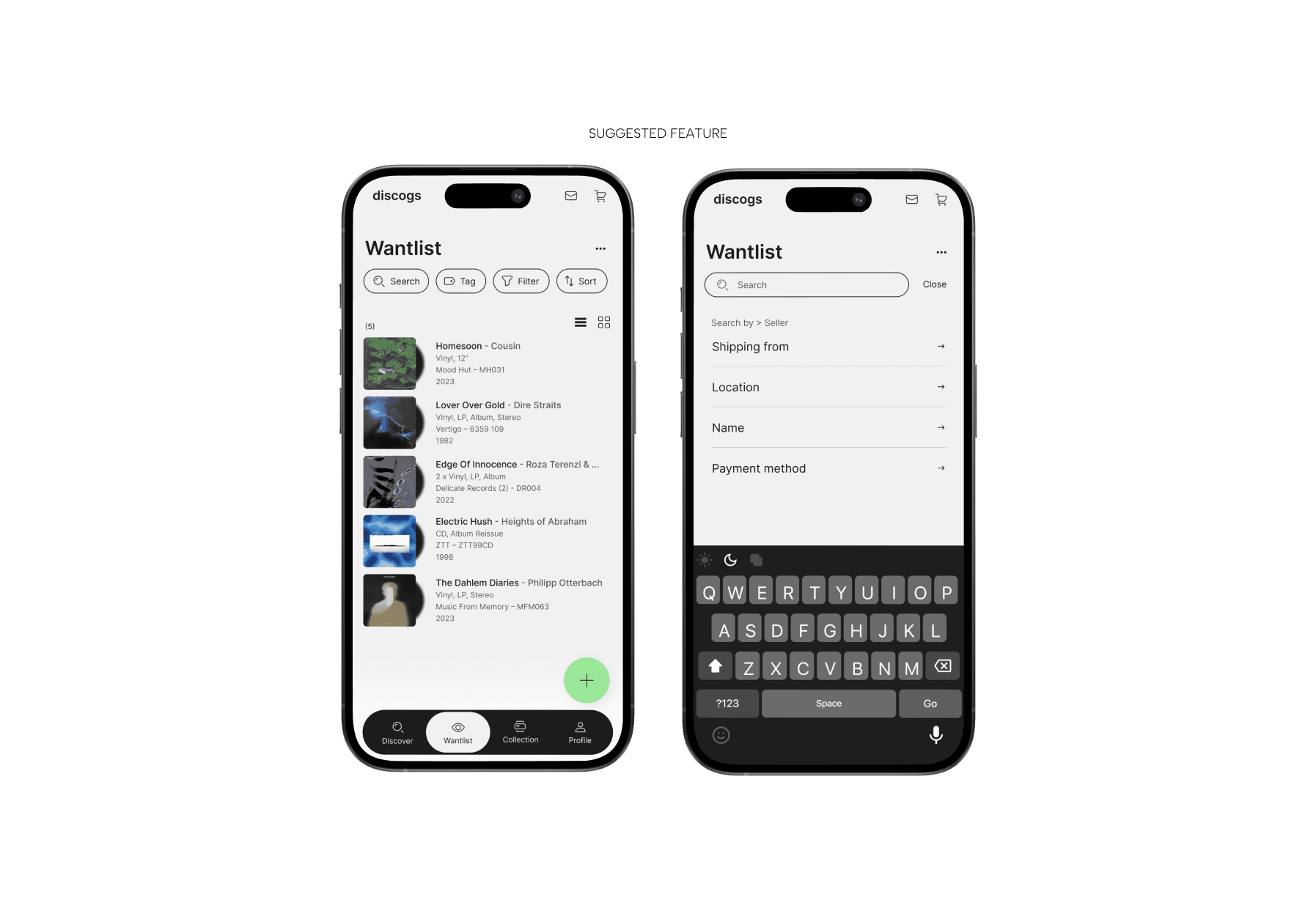
Bridge the gap between digital and real-world record searches: by intergrading the app with users' wantlists. This would allow users to locate local or online stores that carry items from their wishlist, providing a seamless way to discover desired records, especially when exploring new cities. A location-based filter within the wantlist could further personalize the experience, allowing users to sort by store availability or proximity. Example use case: A user traveling to a new city could use the app to locate a nearby record store that carries rare items from their wantlist, strengthening the connection between their digital and real-world collecting habits.
(3) WANTLIST AND COLLECTION MANAGEMENT
The wantlist and collection features are essential tools for Discogs users, but can become difficult to manage as libraries grow. Limited organization options and a lack of advanced functionality often prevent users from efficiently navigating and utilizing their lists.
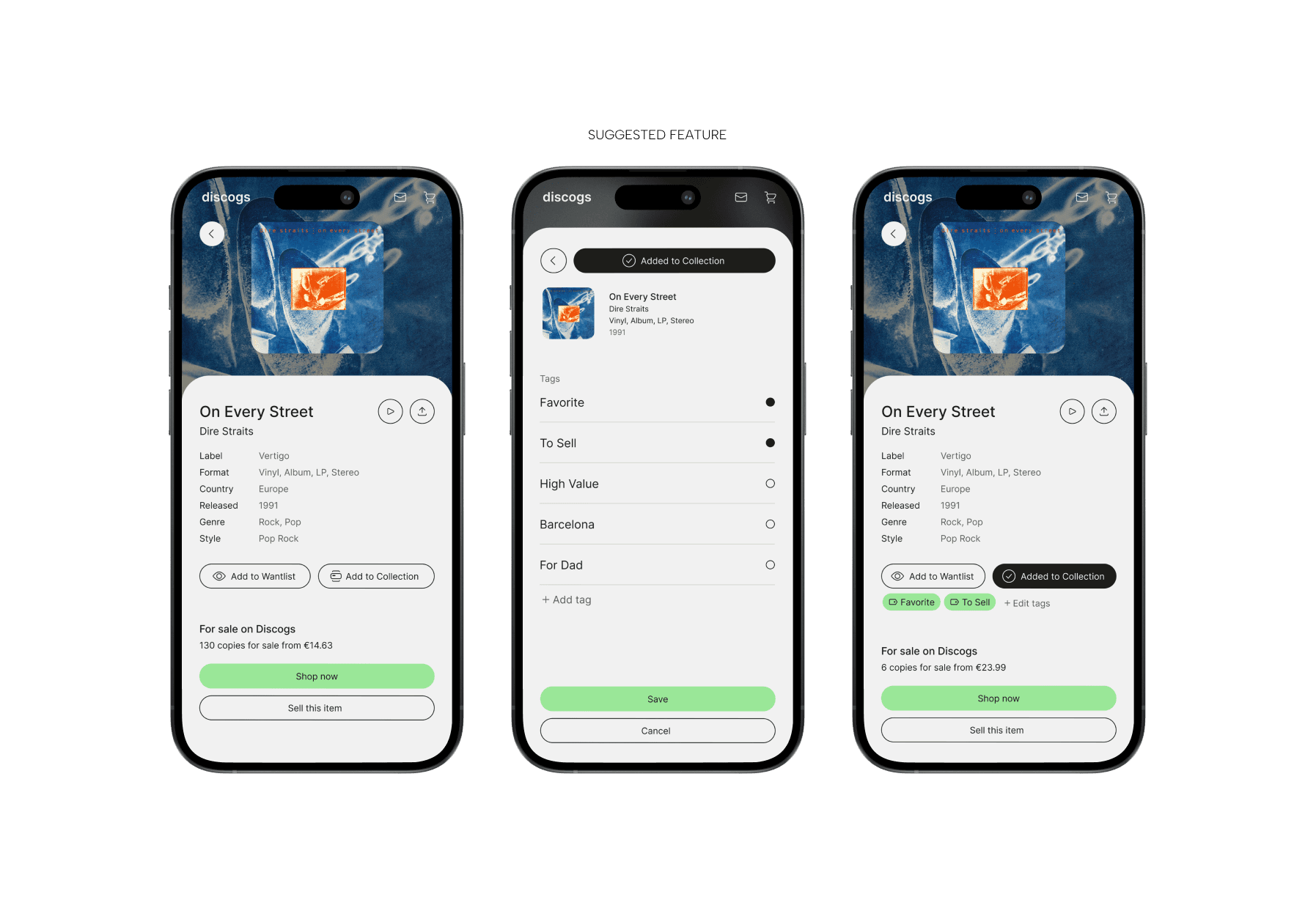
Customizable Categories and Tags
Allow users to create custom tags (e.g., "Favorite Pressings," "To Trade," "High Value") and folders within their wantlist and collection. This would allow them to organize items more intuitively and reflect their unique preferences.
Introducing Shareable and Filtered Lists: Allow users to share customized sections of their wantlist or collection, such as items tagged "To Sale" or "Favorites," with friends or buyers, or a high-priority "Wish List" to crowdsource tips from the community. Sharing options, including direct links or embeddable formats for forums or social media, make it easy to connect. Example use case: A collector attending a record convention can tag high-priority items, find sellers at the event, and share the list with attendees to facilitate trades or purchases.
REVIEW
The Discogs app is an important platform for music collectors and enthusiasts, but it faces usability challenges that hinder its potential. This case study identifies key areas for improvement-navigation, search, and collection management-and provides user-centered solutions to improve the app's usability and personalization. By introducing a persistent navigation bar, cleaner visual hierarchies, advanced search filters, location-based integrations, and customizable collection management tools, the redesigned experience aims to bridge digital and real-world record collecting. These enhancements prioritize the needs of Discogs' diverse user base, providing a more intuitive, engaging and personalized application that strengthens the community's connection to physical music formats.
