(
8
)
Marineterrein is located on Kattenburg at the east side of the centre of Amsterdam. Since 2011 the public has access to the west side of the terrain and it is getting developed as a innovative area with a culture of learning, living, working, sporting and recreation. Marinfo is a digital and spatial solution solution for crowd management of the site, consisting of a web application and onsite screens.
year
2020
location
Amsterdam, Netherlands
client
Marineterrein
technique & tools
Figma, Adobe CC, Notion
PROBLEM STATEMENT & FUTURE INTENTION
The problem at Marineterrein is that the terrain can be overly crowded. When that is the case the areas are not manageable, which results to the possibility of an area clear-out, due to Covid-19. They asked for a spatial information system which contain a number of large screens placed in public space. These screens inform community members and visitors about activities, important information and manage the crowd.
TAGET AUDIENCE
The target audience is broad since it is environment for everyone. Designing a system that prevents the terrain from being too crowded will benefit all target groups in the end, but mainly people who come to the terrain for recreational purposes. The main goal of the target audience is to relax, have a good time and get out of the city environment of a bit.
DESIGN CHALLENGE
How can I design an interactive crowd management system with the use of two devices, which will manage the recreational, learning and working environment at Marineterrein and hereby creating a better spread density and informing visitors about the site?
To inform
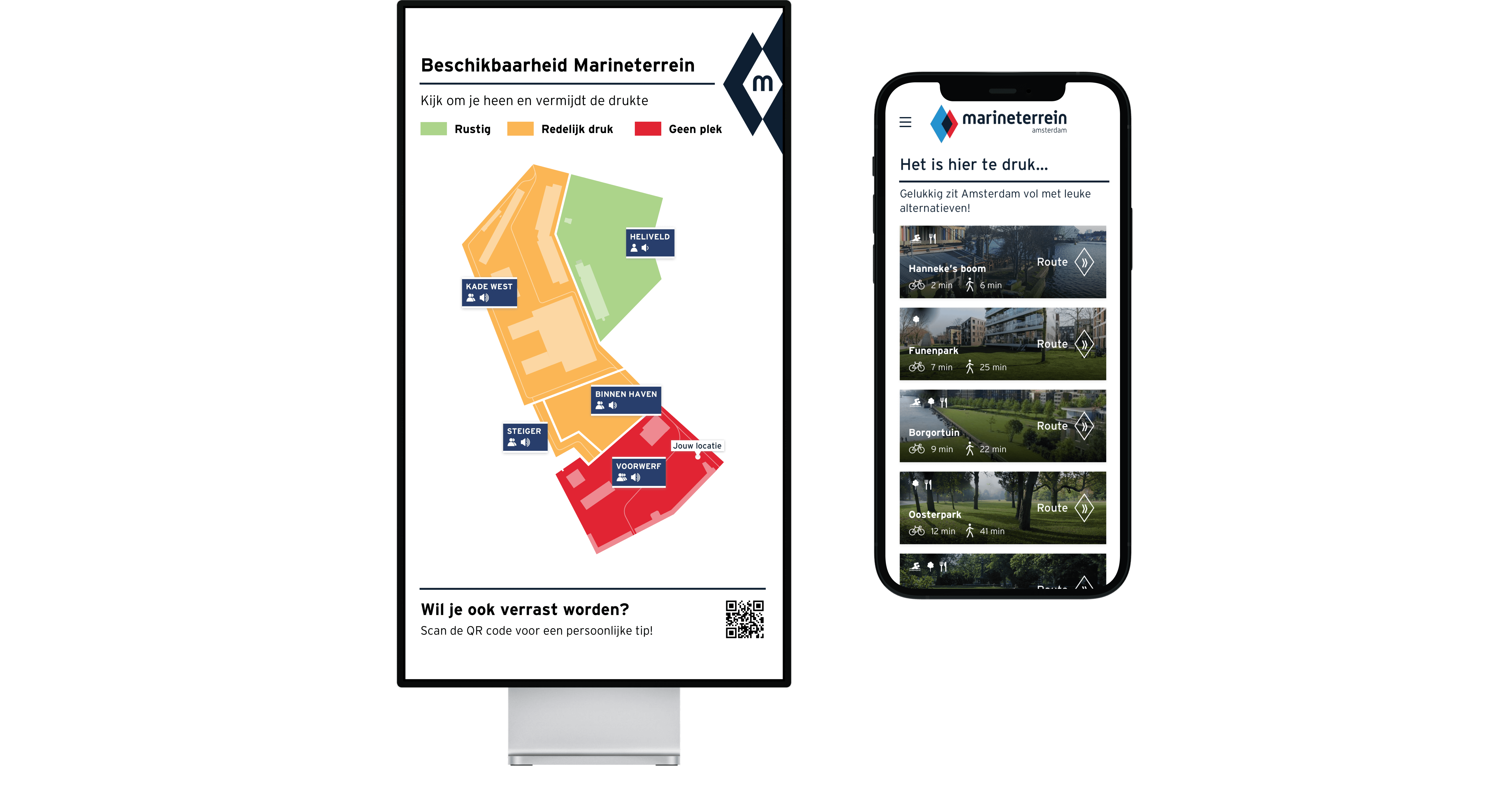
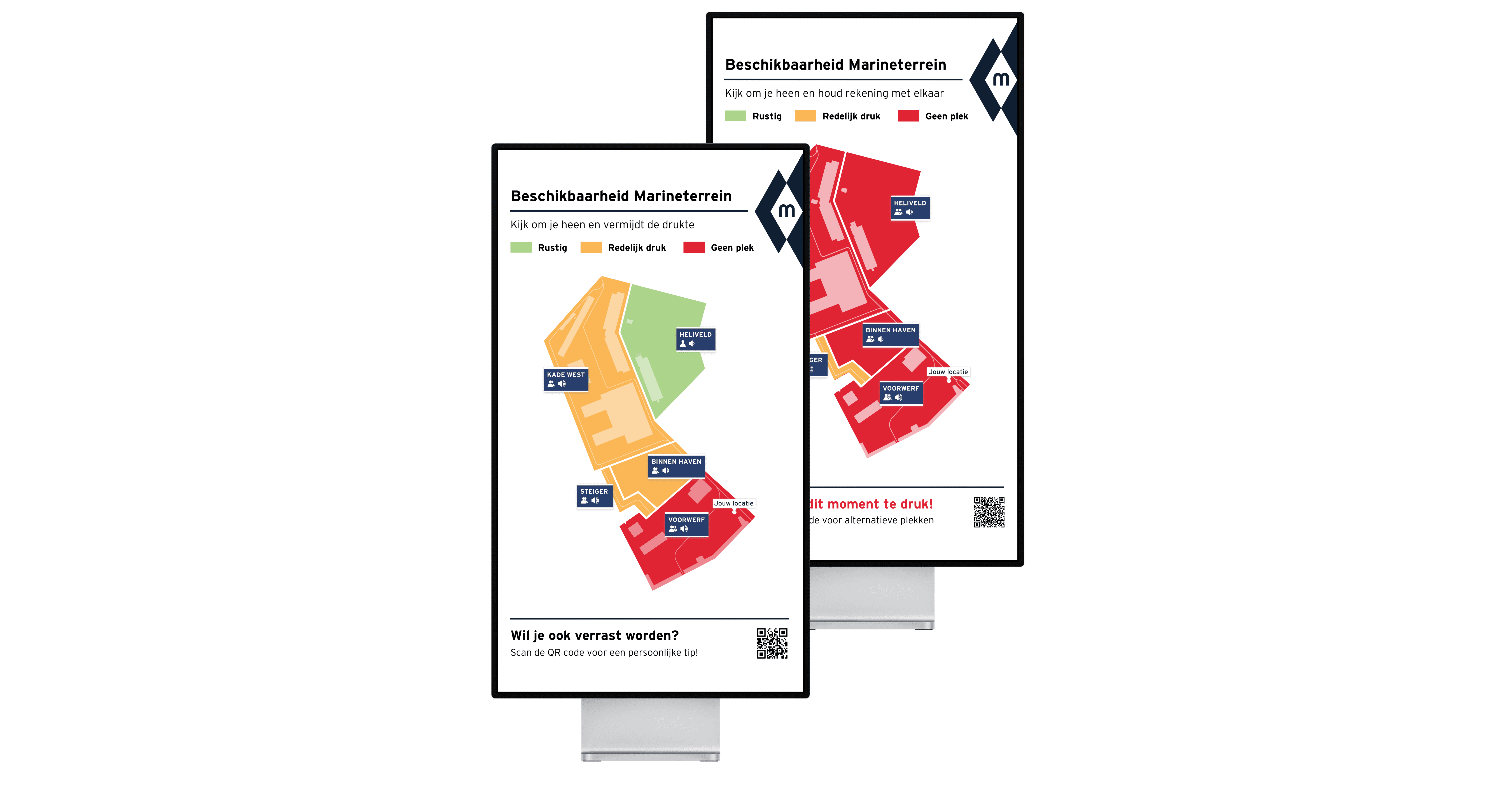
To inform the visitors directly on the terrain there are multiple digital screens placed in different areas. These screens provide real-time information about the spread density and amount of noise. The screens are used to inform users about the five different areas on the terrain when they just arrived. It shows where it is busy, where it is not and what areas are recommended (green) and which are not (red). The QR code at the bottom of the screen links to the web extension.
To direct
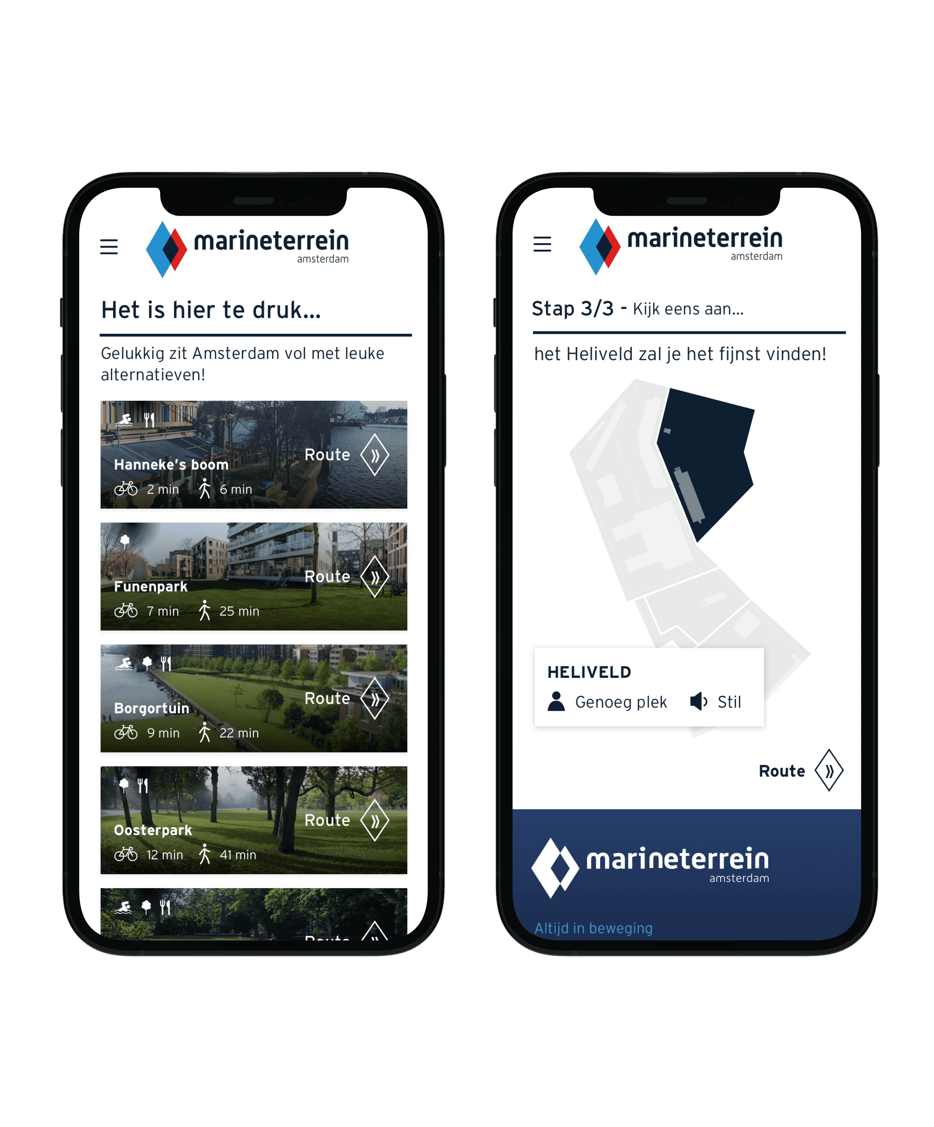
To direct the visitors into the right direction there is a web extension connected to the onsite screens. It consists of two different questions about the terrain, followed by an area recommendation. This recommendation is based on the answers of the visitor and the state (density and noise in certain areas) of the terrain. This step in the process is present to make the experience of the visitor personal and easy, by providing possible directions;
It causes people who come to the terrain with the same intentions, to be located together. If someone wants to relax, they can be surround by other people who want to relax, for instance. Instead of being surrounded by playing children and groups of friends with music.
Within this part of the process there is influence on the place that visitors are going to. Overly crowded places will not be recommended. This way the crowd is managed.
The overall value of Marinfo is that it reduces effort, it informs, it organizes and reduces risk. Please see the product biography for extended documentation.
NEXT STEPS AND LEARNINGS
There is certainly lots that needs to be researched, improved and implemented. This relies on the plans of Marineterrein which are producing outsite working spots. Can these spots be monitored and pick up it’s crowdedness? If yes; making this visual on the map could be very helpfull for a second target audience; People who work on Marineterrein.
I designed a datavisualisation which informs visitors about the site. This enhances the chance that visitors to go less crowded areas on the terrain. Together with the area recommendation this contributes to creating a better spread density and managing the recreational, learning and working environment.
See product biography for all research methods, strategies and findings.
